|
1. Research: What inspired you to make this artwork? What did you do to prepare for expressing this idea?
I first started this piece as a sketchbook and then decided to make it surrealism. To prepare for adding the tentacles I had to render them on a different piece of paper and then exco knife them in. 2. What are you trying to communicate in this artwork? What do you want the viewer to think about or feel when they look at this artwork? Does it communicate successfully? Why or why not? I am trying to communicate tentacles coming out of the glass. I want the viewer to think that they are coming out of the glass and not sure where they will be going. This does communicate successfully by the way the tentacles are spaced. 3. What decisions did you make about media, composition, and the elements and principles of design to help convey your idea? I used colored pencil to render each aspect of it to look as real as possible. I used vellum on the glass to give it the shiny, transparent look glass has. 4. How will you evolve your concentration from what you learned in making this piece? Any new ideas emerging? I will evolve my concentration by using vellum in pieces that may need it. I learned from using it that it was a easy way to make things look like they are under or in something.
0 Comments
1. Research: What inspired you to make this artwork? What did you do to prepare for expressing this idea?
I was inspired to make this piece because one day I was eating pineapple and thought how cool they look. I decided to make one coming out of a head. I used photoshop to make the picture and pineapple come together as one. 2. What are you trying to communicate in this artwork? What do you want the viewer to think about or feel when they look at this artwork? Does it communicate successfully? Why or why not? I am trying to communicate the pineapple coming out of her head. I also am trying to show the pineapple coming around her and moving into the background. I hope the viewer feels like the pineapple is coming out of her head. I do think it does communicate successfully by the way I rendered. 3. What decisions did you make about media, composition, and the elements and principles of design to help convey your idea? I used colored pencil and photoshop for the background. I used colored pencil so I would be able to render the piece realists as possible. I then used photoshop to make the pineapple texture part of the background. I also used photoshop to add in a flat, clean background color. 4. How will you evolve your concentration from what you learned in making this piece? Any new ideas emerging? I liked using mixed media and I hope to use it more in my concentration. 1. Research: What inspired you to make this artwork? What did you do to prepare for expressing this idea? Everyday in society people are comparing themselves to others wanting and wanting to look a certain way. People often turn to cosmetic surgery in order to fulfill what one think looks “right”. I was inspired to make this piece because I have noticed the one thing people do not change is their eyes. Often times people do not surgically change their eyes. 2. What are you trying to communicate in this artwork? What do you want the viewer to think about or feel when they look at this artwork? Does it communicate successfully? Why or why not? I am trying to communicate that people do not get cosmetic surgery on their eyes. For years cosmetic surgery has been a grown trend and is becoming increasingly popular in America. In 2013 the ASAPS shared, the number of surgeries have gone up. Just in 2013 liposuction (16.3%), eyelid surgery (5.4%), breast augmentation (5.2%), nose surgery (2.9%), and tummy tuck (2.3%). Overall, the ASAPS says that cosmetic procedures experienced a 12% growth in 2013 alone, with patients spending a staggering $12 billion over this time period. The question is why don't people get surgery on the eyes? The human eyes seem to be looked at as a chartist body part that does not get changed permanently. I hope the viewer looks at this piece and realizes that the eye is the only natural part of people nowadays. People are too caught up with changing things about themselves when they are fine the way they are. I think it does convey my idea by having the knife close to the eye and the worried look on the face. I the streak marks are giving the sense that the knife is coming to the eye. I used photoshop to have the hand coming in and to smear my face. 3. What decisions did you make about media, composition, and the elements and principles of design to help convey your idea? I choose to use graphite to be able to render the piece to give it a realistic sense while portraying the idea about plastic surgery. I used the composition of having the portite centered so the viewer is focused on the message I am portraying. 4. How will you evolve your concentration from what you learned in making this piece? Any new ideas emerging? After doing this piece it gave me the ideEa for the piece of “Eyes never age”. I learned from doing this that graphite is a good way to work on surrealism. 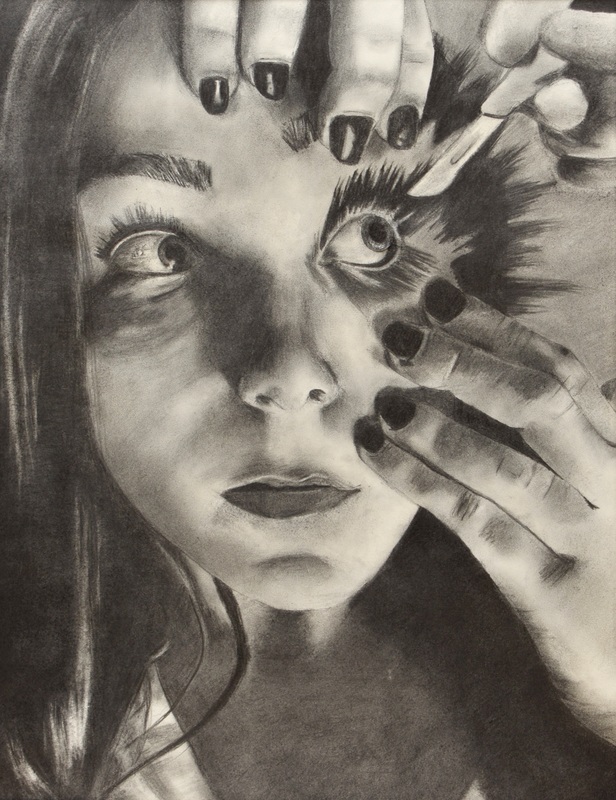 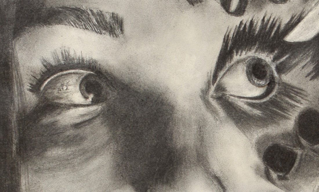 1. Research: What inspired you to make this artwork? What did you do to prepare for expressing this idea? I was inspired to make this artwork because I was fascinated about youth vs elder. I used photoshop to have the eyes coming across the page showing the aging aspect. 2. What are you trying to communicate in this artwork? What do you want the viewer to think about or feel when they look at this artwork? Does it communicate successfully? Why or why not? What I am trying to communicate from this piece that eyes never age. As we grow old and change from being young to old, the one thing that stays the same are the eyes. Our appearances change but our eyes will stay the same. I want the viewer to see that eyes never change but you will. The eyes you are born with are the same ones you will have till you die. I do think this is communicated successfully because of the way I rendered each face to make it look as lifelike as possible while having the young eyes change to being old eyes. 3. What decisions did you make about media, composition, and the elements and principles of design to help convey your idea? I used colored pencil so I would be able to have sharp clean lines. I decided to use this composition so half the face young and half the face was old while the eye moved across the page. I used movement between the eyes to help create space and balance between old and young. 4. How will you evolve your concentration from what you learned in making this piece? Any new ideas emerging? After doing this piece my concentration will have more pieces that incorporate colored pencil. Using colored pencil helped me have clean lines that were well blended. 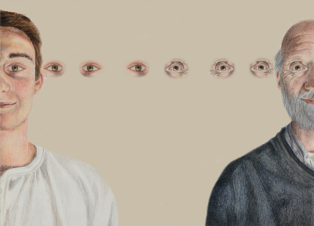 1. Research: What inspired you to make this artwork? What did you do to prepare for expressing this idea? I was inspired by Mrs. E’s piece she did of herself. I also tend to over blend and spend too much time on one part of my piece so I thought I should try not blending and just keeping the colors in blocks. To prepare for expressing this idea I took a straight on picture of my sister. 2. What are you trying to communicate in this artwork? What do you want the viewer to think about or feel when they look at this artwork? Does it communicate successfully? Why or why not? I was trying to communicate not blending and having the colors be blocked in rather than blending. I want the viewer to see the different colors rather than them being blended. It does communicate successfully since I did not blend anything and kept the colors in blocks. 3. What decisions did you make about media, composition, and the elements and principles of design to help convey your idea? I used oil paint so the color blocks would be seen clearly. I had the picture face on and zoomed in so the viewer was focused on it rather than the background. 4. How will you evolve your concentration from what you learned in making this piece? Any new ideas emerging? I am evolving on my concentration from what I have learned from making this piece by not over blending and letting some parts be the way they are rather than spending too much time in one area. 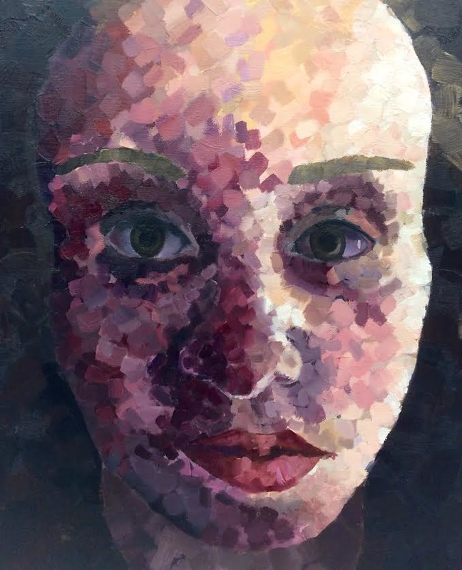 Research: What inspired you to make this artwork? What did you do to prepare for expressing this idea? I was inspired by Alex Garant’s self portraits he does. What Garant does was similar to mine with the movement of the eyes. To prepare for expressing this idea I had to first take a picture that I wanted to use for the portrait. I then used photoshop to to create different layers to make it look like the eyes are moving. After I had the portrait finished I created the background by trying different things on photoshop. I created circles and made layers to give them the sense they were moving similar to the eyes. 2. What are you trying to communicate in this artwork? What do you want the viewer to think about or feel when they look at this artwork? Does it communicate successfully? Why or why not? I was trying to communicate movement of the eyes by making it look like there were many. I want the viewer to feel like they are dizzy and seeing three eyes instead of one. I believe that it was communicated successfully since all the eyes look the same. 3. What decisions did you make about media, composition, and the elements and principles of design to help convey your idea? I used oil paint to convey my idea so I would be able to get detail while working big. I also placed the portrait to the side to create composition off to the side and not having it centered. For the background I used opposite colors to really make the circles pop against the green background. 4. How will you evolve your concentration from what you learned in making this piece? Any new ideas emerging? I am evolving my concentration from surrealism with the moving of the eyes. From making this piece I came up with many ideas. I would like to continue relating my pieces to eyes. 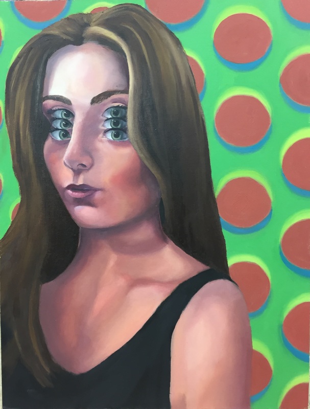 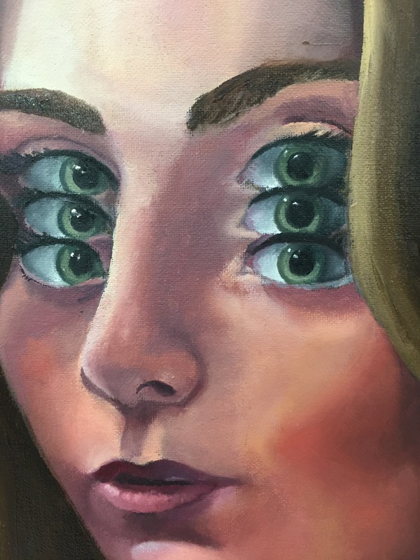 |
 RSS Feed
